
PeopleTools 8.59.01 has arrived. Here at Version 1, I am lucky enough to have access to Oracle Cloud and PeopleSoft Cloud Manager which means we can get all the latest PeopleSoft releases as soon as they drop. I hope to share some of what I find when exploring this new version. So let’s start at the beginning with the first thing that hits you upon logging in. I’m going to look at the redesigned Fluid Homepage.
The very first thing that immediately stands out is the toning down of branding. Look at the subtle ‘O’ in the top left of the header bar, the only hint of what product this might be. It’s like someone at Oracle has been to Ikea and gone very minimalist, but do you know what, I like it.
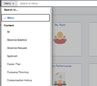
Moving along the header we see the prominent Search bar that Oracle hinted at in their PeopleSoft Planned Features and Enhancement page some months ago. Interestingly the ‘Menu’ dropdown is in fact a content filter so you can search across the ‘menu’ or ‘content’ all from the one bar. That means I can find the Job Data component link and then in the same search bar I can find Job data for an employee.
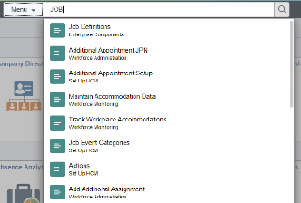
Results appear as soon as you begin typing and refine on the fly as you type. The list of results are presented as a modal dropdown from the search box. It will be interesting to see how this performs, as I can remember issues with the type ahead on some implementations. However, it seemed pretty slick on this instance!
Finally. we make it to the right of the header bar where the Action Icons sit, but they have been reduced to only 3 on the home page, Home, Actions Menu and Nav Bar. This reduction in icons is mainly due to the redesign of the interface, we don’t need the looking glass Search as we have our centre stage Search bar and the notification bell isn’t there because they have moved notifications, but more on that later.
![]()
A tentative click on the Nav Bar icon brings up a much more slimline version of the navigation tool, clearly the Nav Bar has taken advantage of Lockdown to shed some pounds. We have some new minimalist icons for the important things, such as the Recently Visited and Favourites, as well as for the renamed Menu (no longer Navigator). I wonder if the rename of this is because the past menu structure did feel like you needed a map and compass to navigate it, whereas this new version is much more intuitive. We all took great pride in memorising where exactly PeopleTools was in the menu structure. Well no longer do we need to because the menu is now … alphabetical!
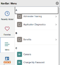
The alphabetical menu structure feels far more intuitive to users of all levels of experience, its as easy as ABC! This has been something that has bugged me for what seems like a lifetime, but I’m glad it has finally made it. Although for those that have invested to much time in the classic jumbled menu you can switch back to that.
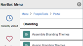
And it gets better. Drill down through the menu and at the top you can welcome back an old friend… Breadcrumbs are back and like the Google Maps of PeopleSoft they are here to rescue you from getting lost.
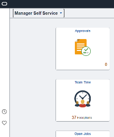
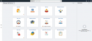
Moving away from the header and onto the homepage itself, the icons look unchanged. I think that was the right move, there was nothing broken there the icons are crisp and clean. What is new though, is down the left of the screen we have a new menu bar, that reminds me of the Samsung Galaxy Edge bar. It only has a couple of icons for Recently Visited and Favourites but is a good way to make use of that excess space you have on a landscape form computer rather than cluttering the top. At the moment it looks as though you only get these two icons which looks a little lonely. I wonder if it would have been slicker having this as a favourites bar with your favourites directly on show, I know it would only save one click, but having a huge bar and clicking on one of 2 icons to then bring up a larger list just seems wasteful, but then I’ll argue that it probably looks better on mobile devices, so I will shut up.
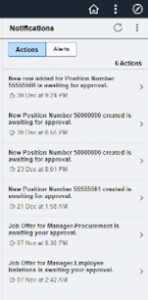
Jumping over to the right side of the homepage we have the newly re-homed Notifications area. My first thought is that those notifications are getting quite a lot of real estate on the page. I would have preferred them as just a popup even on the Homepage. The problem I have with notifications are that they need to be thoughtfully balanced to be of use. If you get too many useless notifications then you just ignore them and I can easily see this Notification frame becoming like the Worklist of yesteryear with hundreds of ‘spam’ notifications which just get ignored.
It’s a shame that some of the changes to the homepage do not continue as you navigate to components, for the prominent Search bar disappears and is no longer available when I navigate to a component, be it Fluid or Classic+. The Action Icon Bar returns to its familiar 5 icons (notifications and search icons) as the Notification pane disappears as soon as you navigate away from the homepage. It would be quite nice to have had these stay as part of a consistent UI, but I’m sure this will be coming in the future.
Overall though I have to say I like the changes to the UI. The look is cleaner, more focused. The functionality is more intuitive and user friendly, navigation feels like it is slicker. Will it make your day to day job any better? With the return of our beloved Breadcrumbs, you have to say yes!